In this Blog Post:
The Facebook App
Facebook, an app known by many, an app being enjoyed by its users, and of course, an app being used by a lot of people to connect with one another, at least virtually. That’s how most of us view Facebook and that’s what we usually think of when we hear or read the word Facebook. Well, we aren’t wrong, but only if we’re talking about the Facebook App.
The Facebook Company
Just this November 4, 2019, a blog post from the FACEBOOK Design about the designing of the Facebook Company Brand came up. According to this blog post, today, whenever people hear the word “Facebook” they think of the Facebook app. Well, who could deny that? I’m honestly one of those people who think of it that way. Because of that, the Facebook company saw the need to establish a distinction between the Facebook App and the Company.
The New Facebook Logo

The Facebook App logo, as shown in the FACEBOOK Design blog post, will, for now, remain as the blue facebook logo we all are familiar with, while the Facebook Company logo will go all-caps. The new wordmark design for the company uses custom typography, rounded corners, open tracking, and of course, capitalization. Aside from those, unlike the Facebook App logo which has been blue ever since we know it, the Facebook Company will not stick to just one color. Instead of owning a single color, the Facebook Company designed a wordmark that is responsive to its context and environment. Facebook Company wants their wordmark to take on the color of their individual brands and to create a clearer relationship between the company and the products they build.
The New Logo to Better Communicate their Ownership
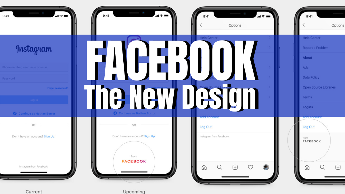
Aside from using their new company wordmark to create distinction from their well known product which is the Facebook App, they will also use the new branding to become clearer about the products that came from the Facebook Company. They showed us in their FACEBOOK Newsroom blog post an example of what it will look like in Instagram. The Facebook Company’s logo matches the colors that are currently being used by Instagram on its logo, which shows exactly how the new wordmark of the company takes on the color of their individual brands.
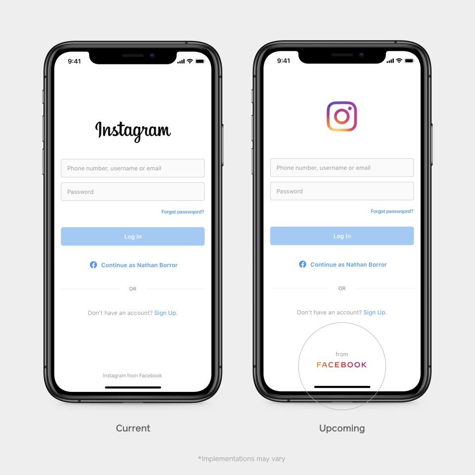
The new logo doesn’t only make a brand distinction between the Facebook App and the Facebook Company; Facebook also believe that the change in their company’s wordmark or logo is a way to better communicate their ownership structure to everyone (people and businesses) who uses their services.
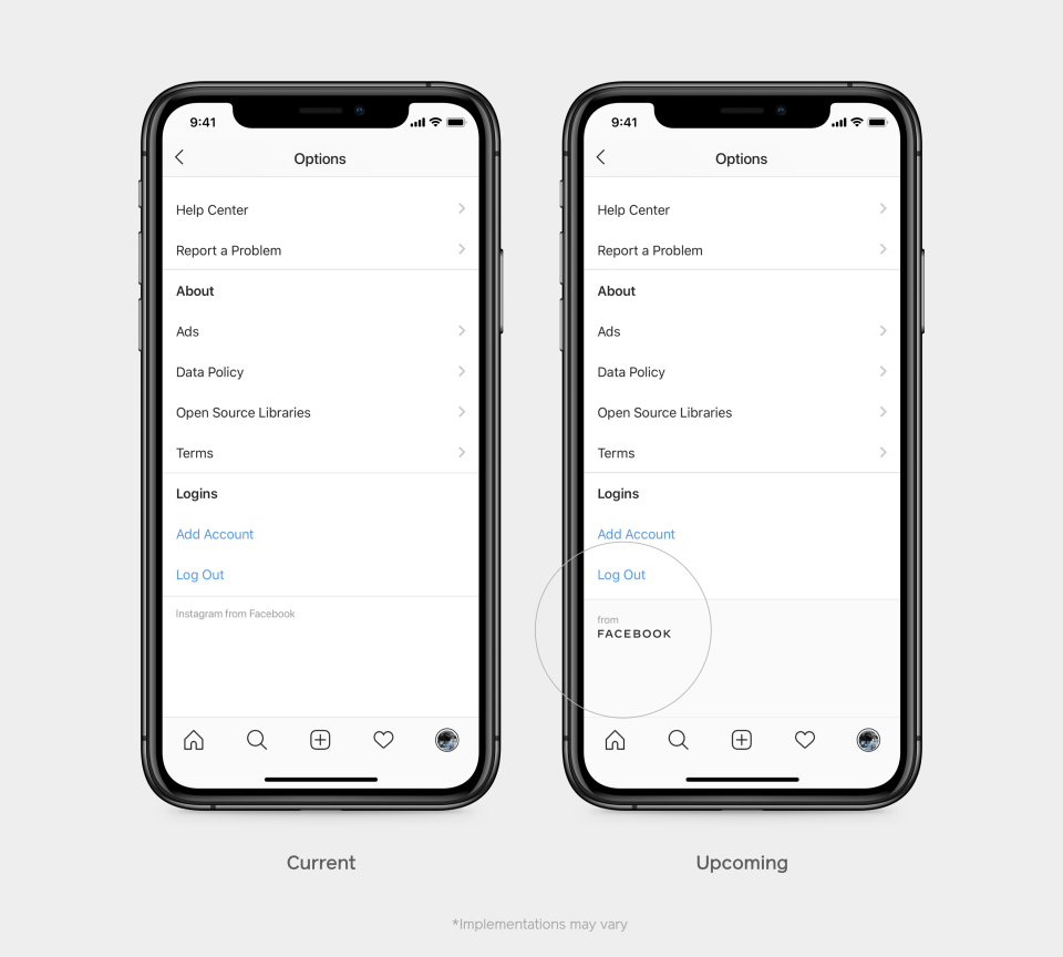
Upcoming Changes
These are the upcoming changes about FACEBOOK that we’ll soon see, not just in Instagram but also in their other products such as Messenger, WhatsApp, Oculus, Workplace, Portal and Calibra.
What do you think about these upcoming changes? Let us know about your say regarding this tech news in the comment section below.
